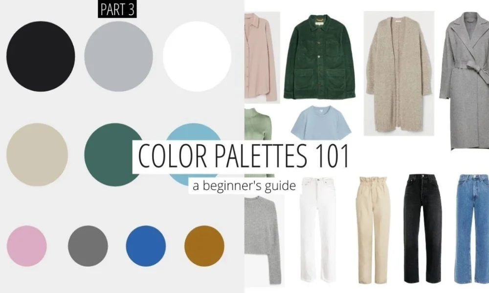
A luxury wardrobe color palette is not built by picking colors you like. It is built by understanding which colors genuinely work with your specific coloring, and then choosing the finest versions of those shades. Color season analysis has been used by stylists for decades. What has changed is how precisely it can now be applied to high-end wardrobe decisions.
This is not about restricting what you wear. It is about understanding why certain shades make you look rested and radiant while others wash you out or flatten your complexion regardless of how much the garment cost. The answer almost always comes back to undertone and seasonal coloring.
The following guide breaks down each color season, translates it directly into luxury wardrobe choices, and gives specific brand recommendations that align with each palette.
What Is Color Season Analysis and Why Luxury Stylists Use It
Color season analysis divides personal coloring into four broad categories Spring, Summer, Autumn, and Winter based on the warmth, depth, and contrast of your skin tone, hair color, and eye color. The theory is rooted in color wheel principles. Warm, golden undertones sit on one side. Cool, bluish undertones sit on the other. Depth ranges from light to rich, and contrast ranges from low to high.
Luxury stylists use this framework because it takes guesswork out of expensive decisions. When you know your season, you can scan a boutique for your palette immediately rather than trying on twenty pieces hoping one will land.
It also sharpens investment thinking. A camel coat on a warm-toned person can look like the piece was made for them. On a cool-toned person, the same coat can read slightly flat. Same garment, completely different result. That distinction is worth understanding before you spend at a luxury level.
The Four Color Seasons Translated Into Designer Wardrobes
Spring: Warm and Light Best Luxury Picks
Spring coloring is characterized by warm undertones, light to medium depth, and a naturally fresh, clear quality to the complexion. Think golden blondes, strawberry hair, peach or golden skin tones, and warm hazel or green eyes.
Spring palettes thrive in colors that are light, clear, and warm. Coral, peach, warm ivory, camel, golden yellow, warm turquoise, and light warm greens all sit beautifully against Spring coloring. The key word is clear — muted versions of these shades can feel heavy against a Spring complexion rather than lifting it.
In the luxury space, Jacquemus, with its sun-saturated palette and warm Mediterranean references, is a natural match for Spring coloring. Bottega Veneta’s warmer seasonal collections frequently deliver the rich but clear warm tones that Spring types wear best. The challenge is avoiding anything too muted or too cool those shades consistently flatten the complexion.
The best neutral base for a Spring wardrobe is warm camel or ivory rather than navy or charcoal. Build outward from there.
Summer: Cool and Muted Brands That Get It Right
Summer coloring is cool-toned and muted. Ashy blondes and brunettes, rose-tinted skin, and light cool-gray or blue eyes are the defining characteristics. The distinction between Summer and Winter is contrast Summer sits at the lower end of the contrast scale, with hair and skin closer in depth.
Summer thrives in blued pinks, soft lavender, cool taupe, powder blue, cool raspberry, and gray-toned whites. Bright, warm colors orange-based reds, golden yellows, strong warm terracotta tend to overwhelm this coloring rather than complement it.
Loro Piana is perhaps the single best luxury house for Summer types. Their dusty, sophisticated palette of muted grays, soft blues, and toned-down pinks aligns almost perfectly with what Summer coloring wears best. The Row also works well, with its commitment to cool, quiet neutrals that never shout.
For eveningwear, Summer coloring shines in dove gray, blush, and soft berry. Silver and white gold hardware is almost always more flattering than gold on this coloring.
Autumn: Warm and Deep The Season Made for Quiet Luxury
Autumn coloring is warm and deep, with golden, olive, or amber-toned skin. Hair tends toward auburn, deep brown, or copper. Eyes are often warm brown, amber, green, or hazel. The luxury wardrobe color palette for Autumn is arguably the richest of the four seasons.
Burnt orange, terracotta, deep olive, warm chocolate, forest green, mustard, and rust are all natural fits. These are also the exact colors that define the quiet luxury aesthetic deep, earthy, and sophisticated without relying on flash or logo.
Brunello Cucinelli, whose entire brand identity is built around warm, dusty, earthy neutrals, is perhaps the single best match for Autumn coloring in the luxury space. Loro Piana’s earthy cashmere collections are deeply aligned as well. Zegna’s earth-toned outerwear lines also deserve serious attention.
The risk for Autumn types is overcorrecting into an all-warm palette that starts to feel heavy. Balance mustard and terracotta with deep forest greens, warm creams, and occasional dark olive to keep the look from closing in.
Winter: Cool and High Contrast Bold Designer Statements
Winter coloring is cool-toned and high contrast. Deep brunettes or black hair, pale or very deep skin, and cool dark eyes define the classic Winter profile. This is the season with the highest natural contrast between hair, skin, and eye color and the coloring that can carry shades that would overwhelm most other seasons.
True black, pure white, icy grays, electric blue, deep plum, and jewel tones all read strikingly on Winter types. The contrast-heavy nature of this coloring means strong, saturated colors serve rather than overwhelm.
Valentino’s deep, high-contrast seasonal palettes are a natural fit for Winter coloring. Givenchy’s architectural use of black and white is built almost specifically for this type. For accessories, Winter coloring calls for clean white gold or silver hardware, deep burgundy leather, and black patent finishes.
The mistake most Winter types make is staying in all-black because it is safe. Black is strong on Winter coloring, but the palette handles much more. Deep jewel tones sapphire, emerald, garnet offer real alternatives to the standard black base.
How to Identify Your Color Season Without a Professional Analyst
The vein test is the most reliable quick method. Look at the inside of your wrist in natural light. Blue or purple veins indicate cool undertones. Green veins suggest warm undertones. A mix of both points toward a neutral season.
Jewelry reveals a lot as well. If gold makes your skin glow and silver reads flat, you are likely warm-toned. If silver brings clarity to your eyes while gold feels heavy, you lean cool.
The paper test is worth trying. Hold a crisp white piece of paper next to your face in natural daylight, then do the same with a cream or off-white piece. Whichever looks better against your skin tells you whether you sit in the cool or warm half of the spectrum.
For a more precise reading, a professional color analysis session is a worthwhile investment given how much it can clarify your buying decisions over the long term.
Luxury Accessories That Work Across All Color Seasons
Some pieces transcend the season system. A beautifully made black leather handbag with silver hardware serves cool seasons. Deep tan or cognac with gold hardware suits warm ones. Neither limits the other when chosen at a high quality level, because the material quality itself does enough of the work.
Deep navy is one of the most season-friendly neutrals in the luxury space. It leans cool enough for Summer and Winter types while being deep enough not to clash with warmer coloring. A structured navy coat is a genuinely versatile investment across all four seasons.
High-quality silk or cashmere scarves in bridge neutrals — warm ivory, soft stone, dusty blush can unify looks across color seasons. The scarf absorbs the tonal relationship between garment and coloring, making slight mismatches feel intentional.
Building a Monochromatic Luxury Outfit by Season
A monochromatic outfit in your season’s core neutral is one of the strongest signals of personal style at the luxury level. It reads intentional, polished, and deeply considered without requiring any explanation.
For Autumn types, head-to-toe deep olive or rich camel is immediately striking. For Summer, a tonal soft gray or dusty rose creates an impression. For Winter, all-black with varied texture is a classic. Spring types shine in a warm cream or soft terracotta tone-on-tone combination.
The key in monochromatic dressing at the luxury level is texture variation. When color is constant, materials must do the work. Cashmere next to leather next to woven wool creates depth that makes an otherwise simple outfit genuinely interesting. This is where a strong luxury wardrobe color palette pays for itself not in individual standout pieces, but in how naturally and consistently everything works together.
Frequently Asked Questions
What is the easiest way to figure out my color season?
Start with the vein test check the inside of your wrist in natural daylight. Blue or purple veins point to cool undertones (Summer or Winter). Green veins indicate warm undertones (Spring or Autumn). Depth and natural contrast then narrow it down to one of the four seasons.
Can I wear colors outside my color season?
Yes. Season analysis is a tool, not a rule. The goal is to understand which colors make you look your best so you can make more confident choices. Wearing an off-season color occasionally is not a style error — understanding the system means you can break it intentionally.
Which luxury brand suits Autumn coloring best?
Brunello Cucinelli and Loro Piana are consistently the strongest matches for Autumn types. Both brands build their identity around the warm, earthy, deep tones that flatter Autumn coloring most effectively.
Is color season analysis the same as skin tone matching?
They overlap but are not identical. Skin tone matching addresses warm vs. cool in a binary way. Color season analysis adds depth and contrast as variables, producing four specific profiles that give more precise guidance about which exact shades work and which do not.
Do color seasons apply to luxury accessories as well as clothing?
Yes. Bag color, hardware finish, shoe tone, and even eyeglass frames all benefit from season awareness. A warm-toned person wearing silver hardware can look slightly off even when every other element of the outfit is correct.