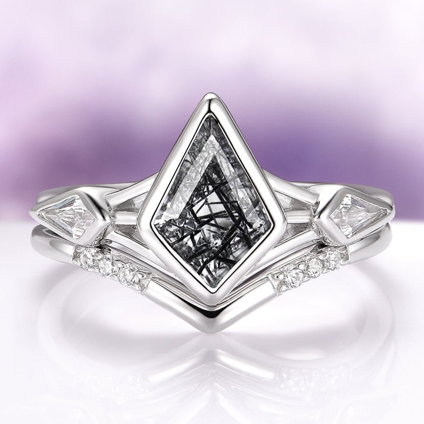
A gothic engagement ring is not one look but a series of choices, and the rings that feel truly personal are the ones where each choice was made on purpose. It is easy to be drawn to the drama of a dark stone or an unusual outline and then discover, once the ring is on a hand every day, that the parts do not quite agree with one another. The good news is that the whole category rewards a little planning.
If you break the design down into a handful of decisions and think each one through, you end up with a ring that reads as intentional rather than costume, and that carries real meaning for a proposal.
Think of it as four core decisions with a few supporting ones. What stone, and in what color. What kind of setting and metal tone frames it. What silhouette the ring takes. And what all of that is meant to say. Get those aligned and the daily-wear questions mostly answer themselves. What follows is a walk through each decision, in the order most people find easiest to reason about.
The stone and its color
Color is usually where a gothic engagement ring begins, because it sets the emotional temperature for everything else. A dark center stone is the signature of the style, but “dark” covers a surprising range. A jet-black stone reads bold and graphic and holds its drama in any light. A deep gray or smoky stone feels softer and more atmospheric, shifting as the light moves.
Stones with internal texture, such as rutilated quartz threaded with fine needles, or a moody labradorite that flashes color at an angle, give you depth instead of a flat surface. Even a very dark red or a near-black green can carry the gothic mood while adding a whisper of unexpected color.
When you compare stones, look at three things: how opaque or transparent the material is, how it behaves under different lighting, and whether it has any pattern you want to show off or calm down. An opaque stone like onyx gives you a clean, uniform darkness.
A translucent smoky quartz lets light travel through it and feels more alive. Brands that specialize in this space, such as Aquamarise, tend to pair each stone with a cut that flatters its particular character, which is a useful cue when you are trying to picture the finished ring rather than just the raw material.
The setting and metal tone, generically
The setting is the framework that holds the stone and, quietly, does most of the styling work. A prong setting lifts the stone up and lets light reach its edges, which suits a translucent or faceted center. A bezel, where a rim of metal wraps the stone, feels more protective and modern and gives a cleaner, more architectural line that many people prefer for a stone they plan to wear constantly.
Half-bezel and prong hybrids split the difference. The setting you choose changes how tall the ring sits and how much the stone is exposed, so it is worth picturing against the way you actually use your hands.
Metal tone is the other half of this decision, and it is best thought about generically rather than by any single alloy. A cool, silvery white tone reads crisp and contemporary and lets a dark stone provide all the contrast. A warmer tone introduces a vintage, candlelit feeling that softens the whole ring and leans romantic. Darker or blackened metal finishes push the design fully into moody territory and make even a modest stone look dramatic.
There is no wrong answer here, only a question of whether you want the metal to recede behind the stone or to be part of the statement itself. Hold a few tones near the skin they will sit against, since undertone changes how each one looks in person.
A dark-stone gothic engagement ring reads dramatic but wearable.
The silhouette
Silhouette is the shape you see from across a room: the outline of the stone and the overall gesture of the ring. This is where gothic design gets to be expressive. An elongated shape, such as a kite, a marquise, or a coffin cut, gives the ring a pointed, architectural drama that feels distinctly gothic without needing any other embellishment.
A softer round or oval reads more classic and lets the dark color do the talking. A cushion or emcut shape sits somewhere in between, structured but not sharp.
Beyond the stone outline, the band and shoulders shape the mood too. Consider a few directions:
- Clean and minimal, where a single dark stone sits on a plain band and everything is about contrast.
- Ornate and detailed, with milgrain edges, engraving, or filigree that nods to old-world gothic architecture.
- Nature-inspired, where the band takes on branch-like or thorn-like lines that frame the stone organically.
- Cluster or halo, where smaller accent stones gather around the center to add sparkle and scale.
Try to settle on one dominant idea rather than combining all of them. A silhouette that commits to a single direction almost always looks more considered than one that tries to do everything at once.
Symbolism for a proposal
An engagement ring is a promise made visible, and a gothic one lets that promise carry a particular voice. For many couples, a dark stone is not about gloom at all but about depth, resilience, and a love that does not need to be conventionally bright to be real.
Choosing a stone with hidden color or internal texture can stand for the idea that there is always more beneath the surface. An unusual silhouette can celebrate a relationship that was never going to follow the standard script.
It helps to talk, even loosely, about what you want the ring to say before you fix the design. If the two of you are drawn to a shared aesthetic, let that be the throughline. If there is a color, a shape, or a symbol that already means something between you, building the ring around it turns a beautiful object into a genuinely personal one. A proposal ring earns its weight from that story, not from following a trend, and a gothic ring gives you unusually rich material to work with.
Choosing a stone that lasts the daily wear
Once the look is settled, durability quietly becomes the most practical decision, because an engagement ring is worn more than almost anything else you own. Stones differ in hardness, and a center stone that sits high on the hand meets doorframes, keyboards, and countertops constantly.
Harder, tougher materials tend to shrug off that contact, while softer stones ask for a gentler routine and a more protective setting.
This is one reason the setting decision and the stone decision are so linked: a bezel can shelter a softer stone that you love the look of, letting you keep the color you want without worrying about every bump.
Think honestly about the hands that will wear it. An active, hands-on lifestyle points toward a tough stone and a low, secure setting. A ring that will mostly be admired rather than put to work opens up more delicate options.
Matching the material to the life it will lead is what keeps a dramatic ring from becoming a fragile one, and it is the difference between a piece that stays beautiful and one that feels precious in the wrong way.
How it wears every day
Beyond durability, there is the simple ergonomics of living with the ring. Height matters: a tall setting is striking but catches on gloves, pockets, and hair, while a lower profile disappears into daily motion. Width matters too, since a broad band feels substantial but can crowd the fingers on either side.
If you plan to add a wedding band later, picture how the two will sit together now, so the engagement ring’s outline leaves room for a companion rather than fighting it.
Comfort is easy to overlook when you are dazzled by a design, yet it is what determines whether the ring gets worn joyfully or quietly left in a dish. The most successful gothic engagement rings are the ones their owners forget they are wearing until they catch sight of them. Aim for that feeling.
A ring that is comfortable in every ordinary gesture is a ring that becomes part of a person rather than a thing they manage.
Keeping it wearable rather than costume
The final decision is really a discipline that runs through all the others: keep the ring wearable rather than theatrical. The line between an elegant dark ring and a costume piece is not about how bold the design is, but about restraint and quality of execution.
A single striking element, a rich stone, an unusual outline, or a beautifully finished dark metal tone, tends to look far more refined than three or four competing statements crowded together. Editing is what separates a fine piece from a novelty.
Materials and craftsmanship carry that restraint. Well-cut stones, clean settings, and considered proportions read as intentional even when the overall look is dramatic. This is where browsing a focused collection helps, because seeing how a maker balances darkness with polish trains your eye.
A curated gothic engagement ring selection shows the range of what is possible while keeping each piece grounded in genuine wearability, which makes it easier to picture your own choices sitting comfortably at the refined end of the spectrum rather than tipping into costume.
Run each decision through the same test. Ask whether the element earns its place, whether it works with the others, and whether it will still feel right in ten years. When every part of the ring can answer yes, you have something that is both unmistakably gothic and quietly timeless.
The takeaway: a gothic engagement ring is the sum of a few deliberate choices, not a single dramatic gesture. Decide on your stone and its color, frame it with a setting and metal tone that agree with that color, commit to one clear silhouette, and let the whole thing carry a meaning that belongs to the two of you.
Then pressure-test it against real daily wear and the discipline of restraint. Make those decisions in order and on purpose, and the ring that results will feel dramatic, personal, and entirely wearable, which is exactly what a proposal deserves.